
Salt & Ice
Handcrafted
Creamery Truck
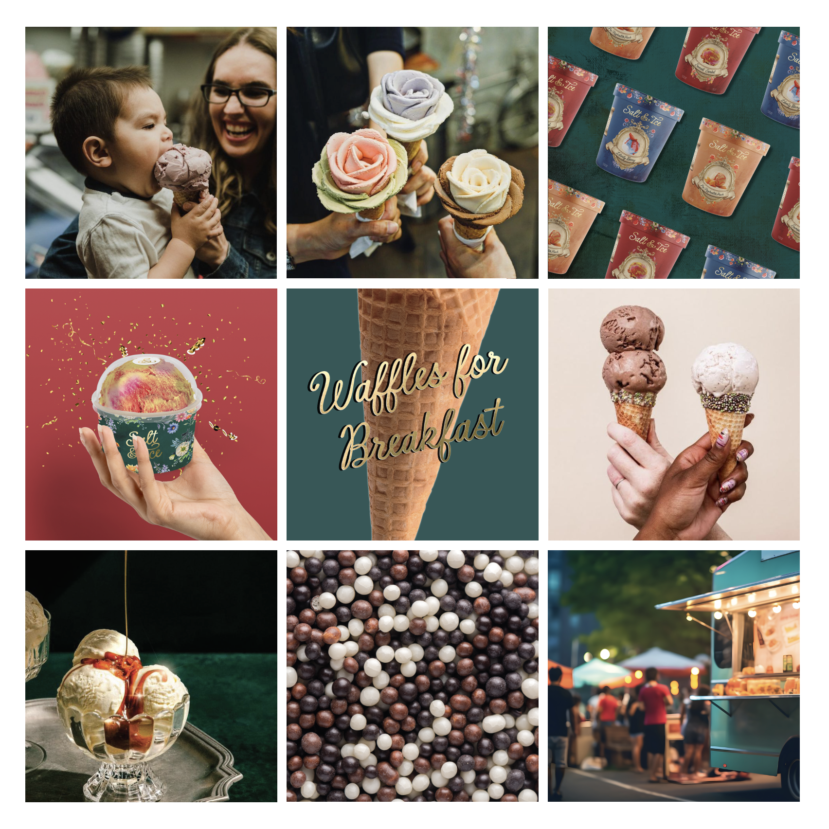
In the spirit of the Romantic era— when ice cream captured the hearts of the public through the innovation of the hand churn, this brand concept pays homage with hand-crafted ice cream and eye-catching brand visuals. This ultra-unique concept was both a challenge and a delight to envision, and bring to life.
Brand Identity
Why it works:

Humanist script with a rough painterly stroke emulates the unique flow of an artist’s signature
Complimentary sans-serif is a nod to vintage ice-cream shop menu typography, legible and inviting



Uniform


Product Packaging


NapkinsTo-go Cups

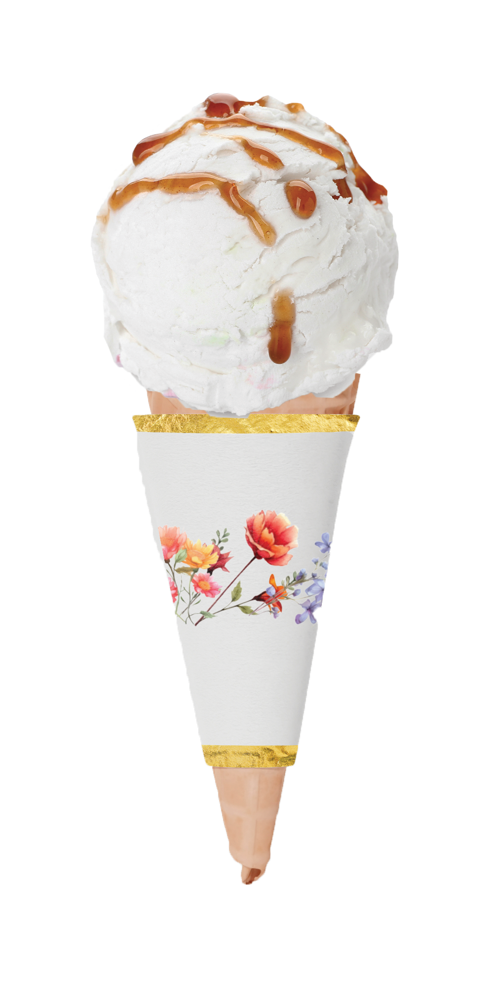
To-go BagsCone Wrap

Toppings

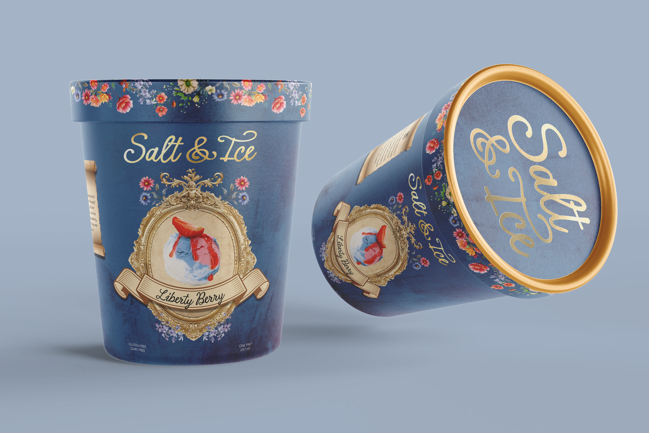
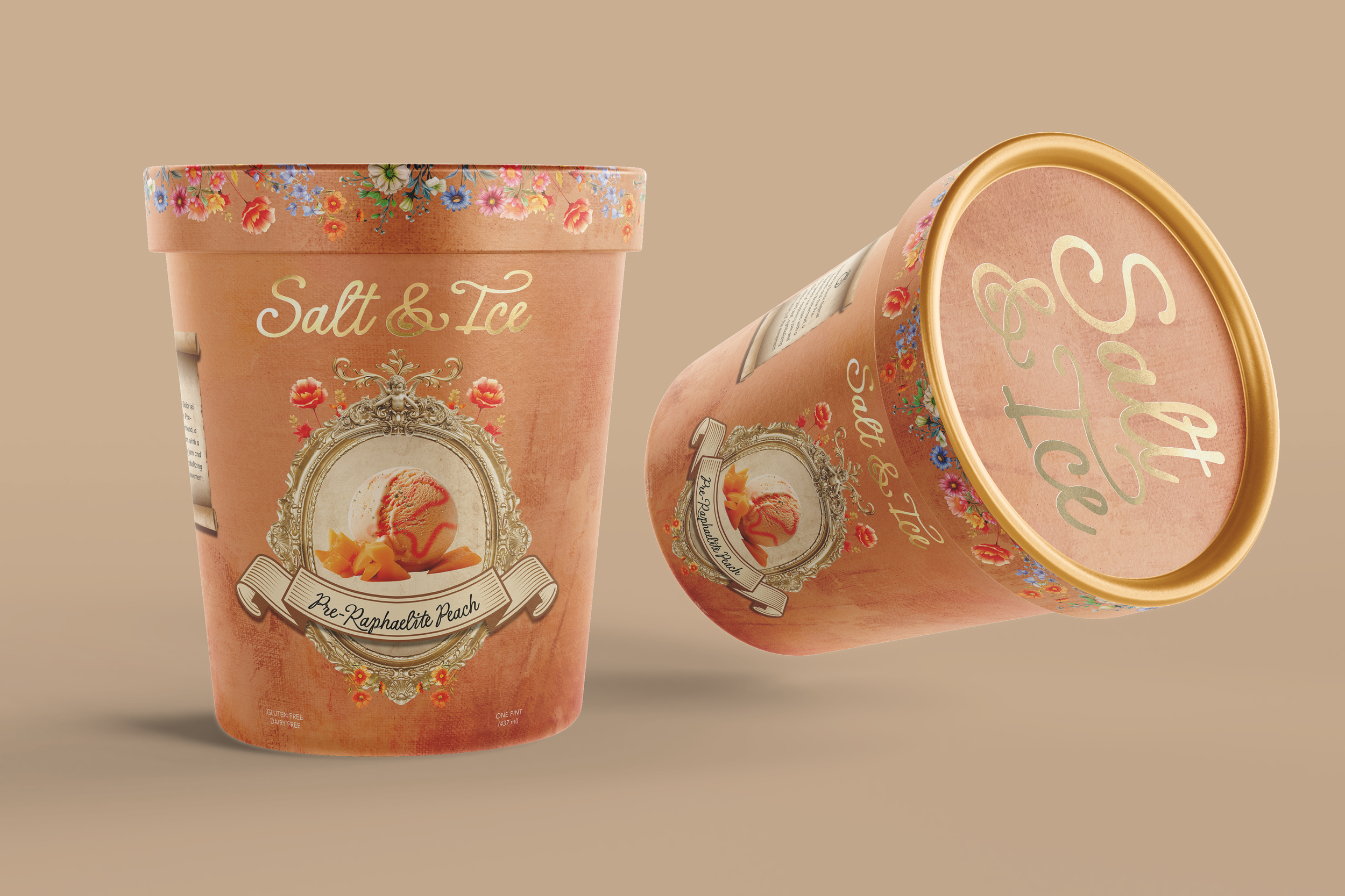
SaucesPint Containers
(Use arrows on the sides or click + drag to see more)

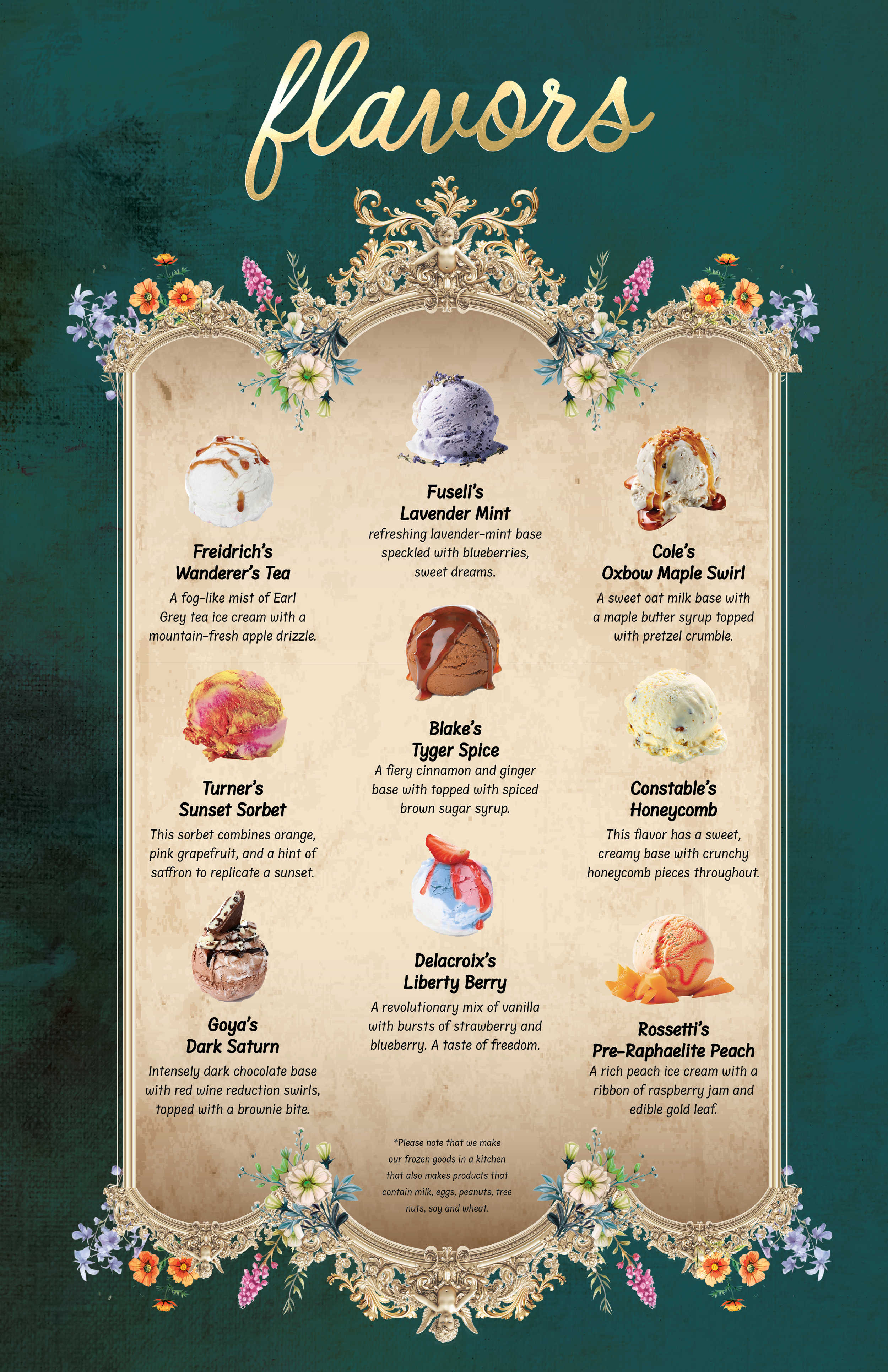
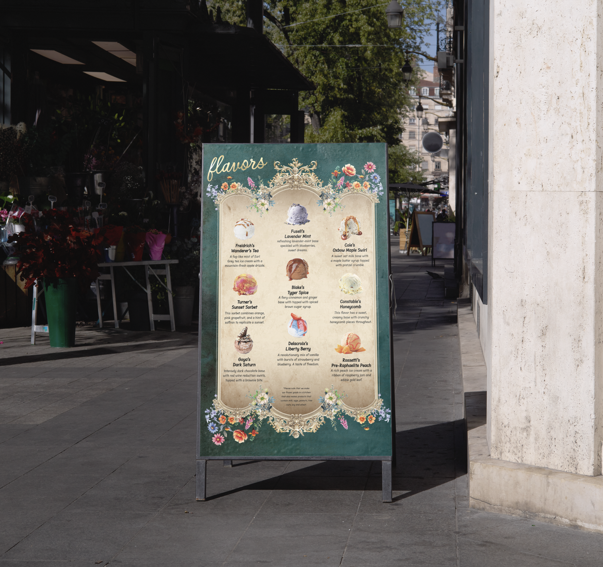
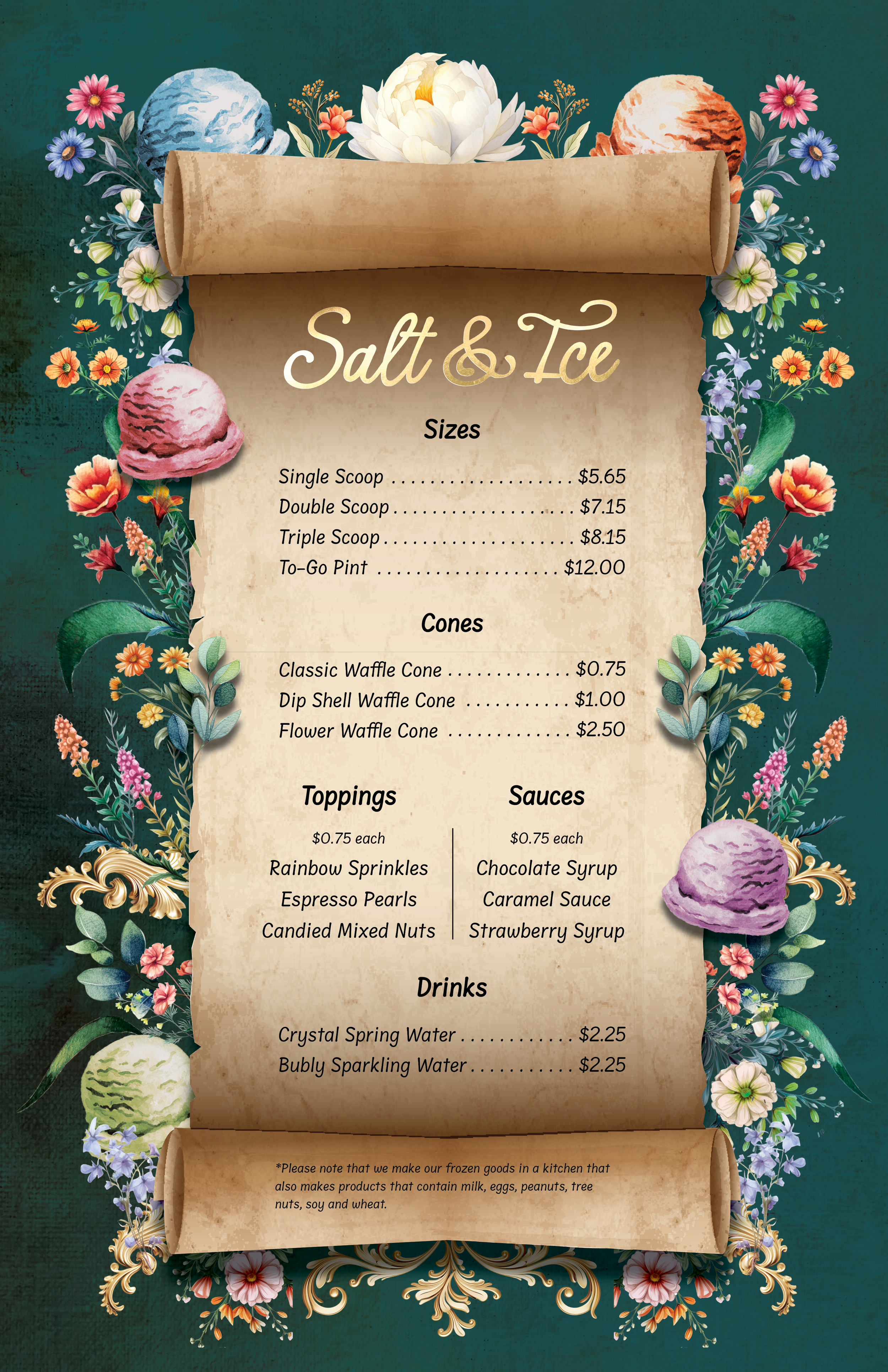
Menu + Flavor Boards
(For use in print, digital, or signage, use arrows on the sides or click + drag to see more)

Process
How I got there
To create Salt & Ice, I started with sketches that combined classical elegance with a modern twist. Using InDesign, I hand-placed flowers to craft menus and packaging that reflected my initial concepts, resulting in a brand that honors the era while showcasing my personal creative touch.
Sketches
(Use arrows on the sides or click + drag to see more)
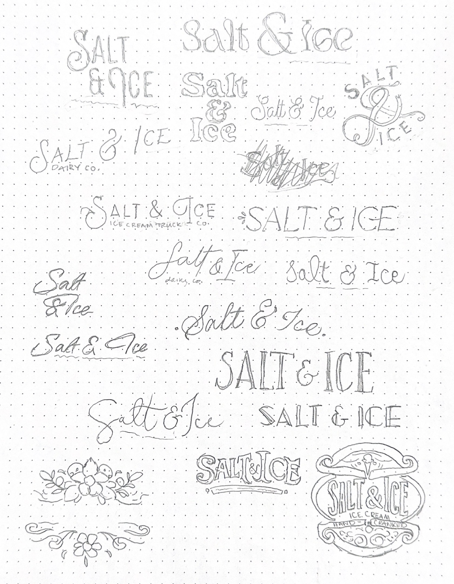
Logotype Sketches
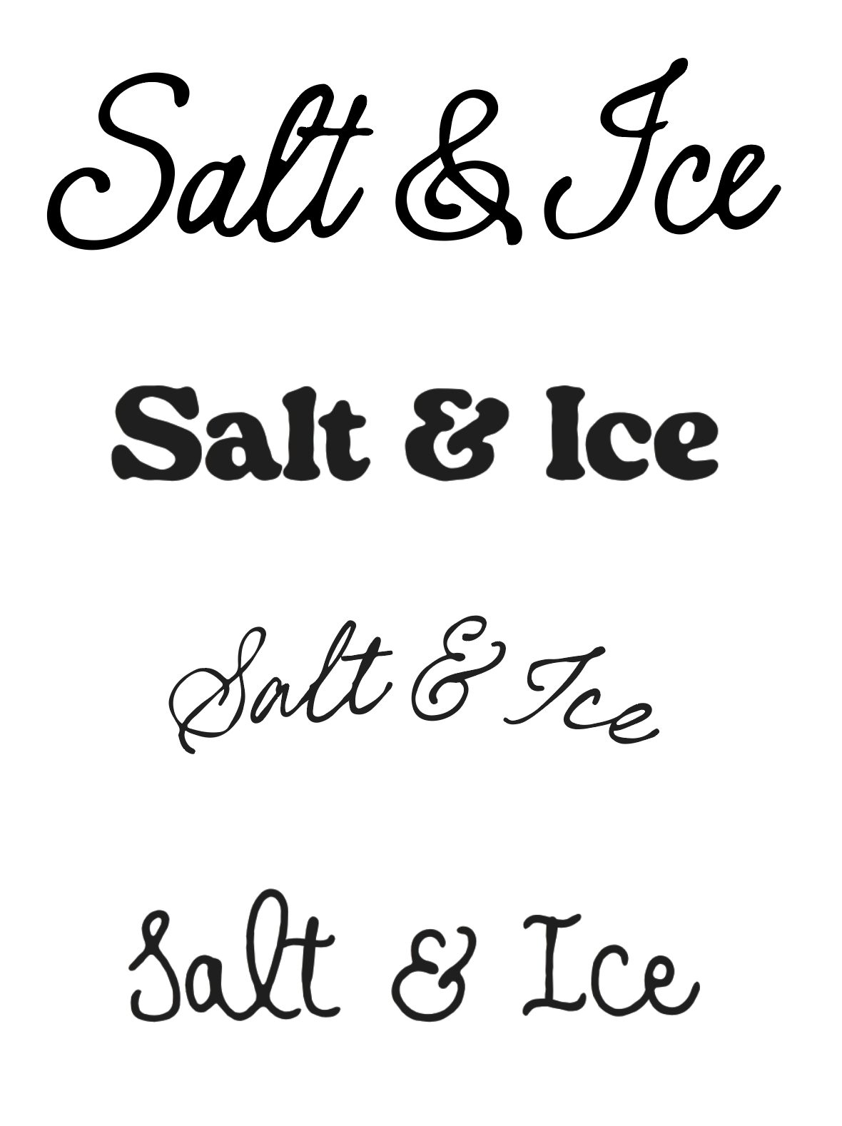
Digital Roughs

Menu Sketches
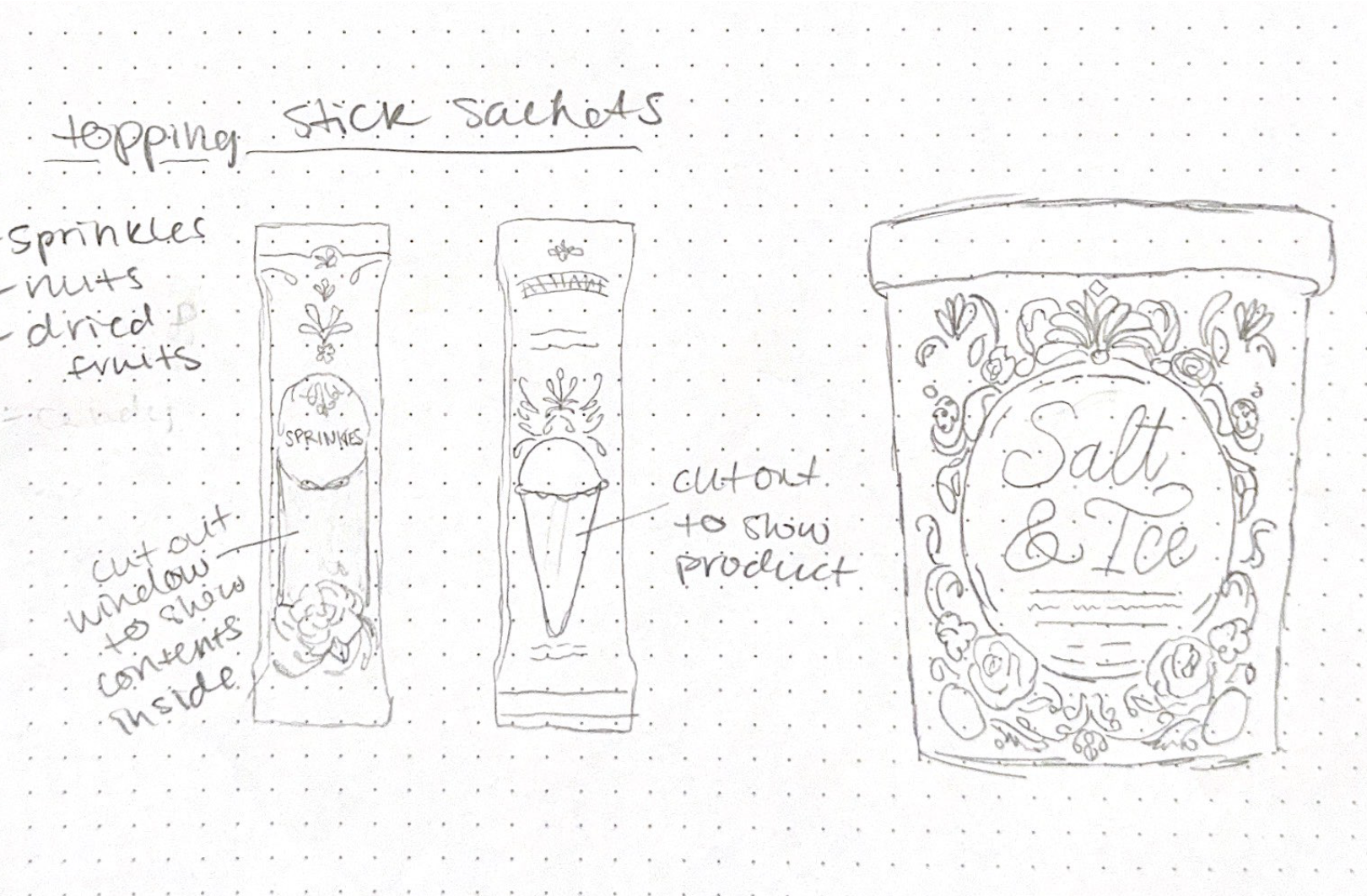
Packaging Sketches